Art-Clusive Responsive Website Case Study

After completing the mobile app for Art-Clusive, I saw an opportunity to expand the experience by designing a responsive website. Rather than replicating app features, this version focuses on planning and orientation, helping visitors feel confident and informed before they ever step inside a gallery. With a strong foundation of user research and accessibility insights, I created a site that supports curiosity, planning, and inclusion across devices.
Tools Used
Figma
Google Forms
Canva
Photoshop
My Role
UX/UI Designer
Researcher
Visual Designer
Goals & Focus Shift (Web vs App)
The Art-Clusive app was designed for in-gallery interaction, supporting navigation, pacing, and real-time customization. This means that users can adjust the app's settings on the go, tailoring their experience to their individual needs. The responsive website, on the other hand, is designed for the moments that happen before a visit: searching for current exhibitions, understanding accessibility accommodations, and previewing the space.
Both the Art-Clusive app and the responsive website prioritize inclusive design. However, the web experience shifts focus from interaction to orientation. It enables users, particularly those with disabilities or sensory sensitivities, to plan visits in a manner that feels informed, approachable, and flexible across all devices. This approachability ensures that users feel welcome and comfortable during their visit to the gallery.
Key Research Insights (Recap)
Research for the original Art-Clusive app highlighted the great variety of user needs. 40% of participants reported having a disability or accessibility need, and many shared that traditional museum websites made it hard to plan. Accessibility information was often buried, hard to scan, or missing entirely.
Visitors expressed the need for:
Precise, upfront accessibility details
A sense of what’s on view before arrival
Options to explore virtually or preview exhibits
Content that’s sensory-friendly, easy to navigate, and available across devices
This insight guided the structure and tone of the responsive website: supportive yet not overwhelming, informative yet not clinical.
Design Solutions: Responsive Web Experience
The Art-Clusive website was designed to guide users through the planning phase of their visit, with a clear structure, responsive layouts, and accessibility as primary features, not afterthoughts. Each page adapts across screen sizes, with the mobile experience simplified for ease of use and the desktop layout expanding to support discovery and orientation.
Rather than duplicating the app’s in-gallery functionality, the website focuses on what comes before: preparation, exploration, and building comfort. These screens highlight key flows that support users in navigating their visit from any device.
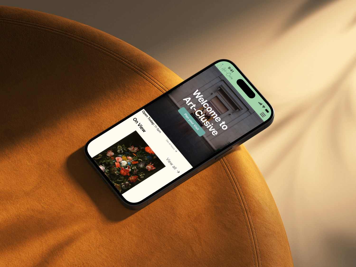
The homepage serves as a digital entry point; it welcomes users with a large hero image, an apparent “Plan Your Visit” CTA, and immediate access to current exhibitions and events. Content blocks transition seamlessly from multi-column layouts on desktop to stacked sections on mobile, ensuring clarity across all devices.
The “Explore from Anywhere” banner invites visitors to preview collections through accessible video tours, giving hesitant users a gentle way to engage before committing to an in-person visit.
Homepage Across Devices

Macbook Pro 16" & 14", iPad Pro 11" & iPhone 16 ProFor many visitors, especially those with access needs or first-time jitters, knowing what to expect can make all the difference. The "Plan Your Visit" page consolidates key information, including hours, admission details, directions, amenities, and accessibility services, into a single, organized location.
Each section is easily accessible, thanks to the tab menu that guides users through the page. The content is organized into clear, labeled blocks that address practical concerns, including sensory-friendly hours, accessible transit, complimentary caregiver entry, and inclusive facilities such as gender-neutral restrooms and quiet spaces.
New additions to the "Plan" section provide extra support on topics such as what to bring, how long to expect your visit to last, and how to navigate the museum with a wheelchair, service animal, or family group. FAQs at the end answer common questions in plain language, so visitors aren't left guessing.
The layout is fully responsive, ensuring a smooth experience whether you're browsing on a desktop at home or checking the hours from your phone on the way. A mid-page "Get the App" banner introduces users to self-guided tours, route planning, and customizable accessibility tools, bridging digital prep with in-person confidence.
Design Flow: Plan Your Visit
*Note: Not all pages may be clickable at this time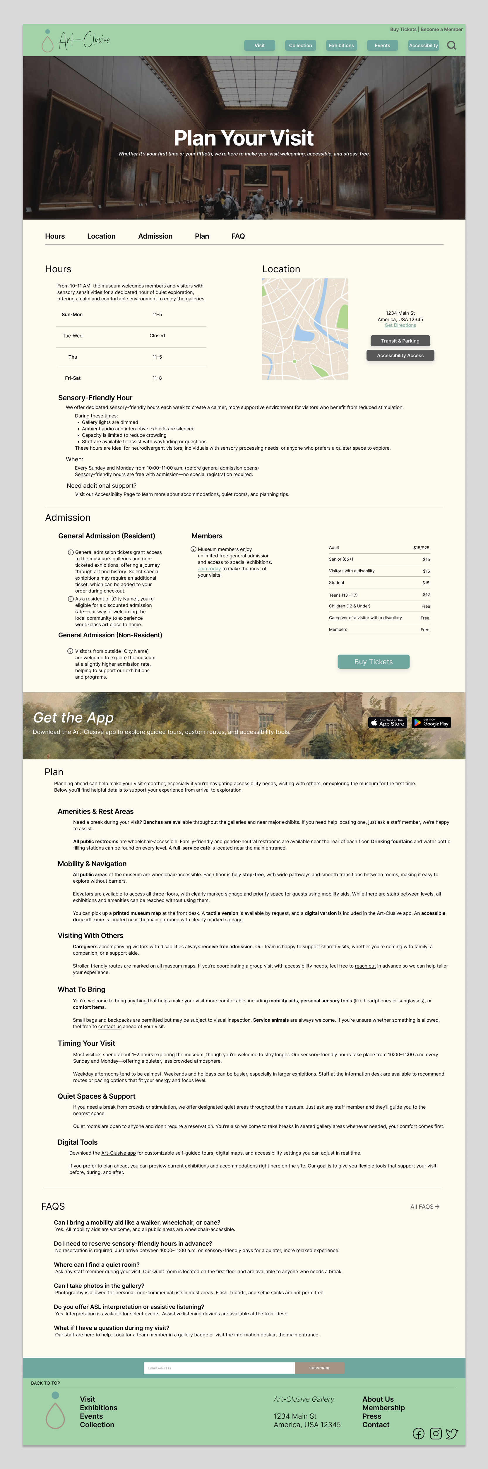
Macbook Pro 14" I designed the Accessibility page to be both a welcoming entry point and a clear guide to support. The "What to Expect" section provides an at-a-glance view of key accommodations, using simple icons and straightforward language to make the information easy to understand. Below that, four visual cards allow users to choose the type of support that best fits their needs, whether they're navigating with a mobility device, managing sensory sensitivities, or seeking accommodations for hearing or vision.
By combining general information with clear pathways to specific support, the page helps users find what matters most to them without unnecessary friction.
Design Flow: Accessibility Overview

iPad Pro 11'“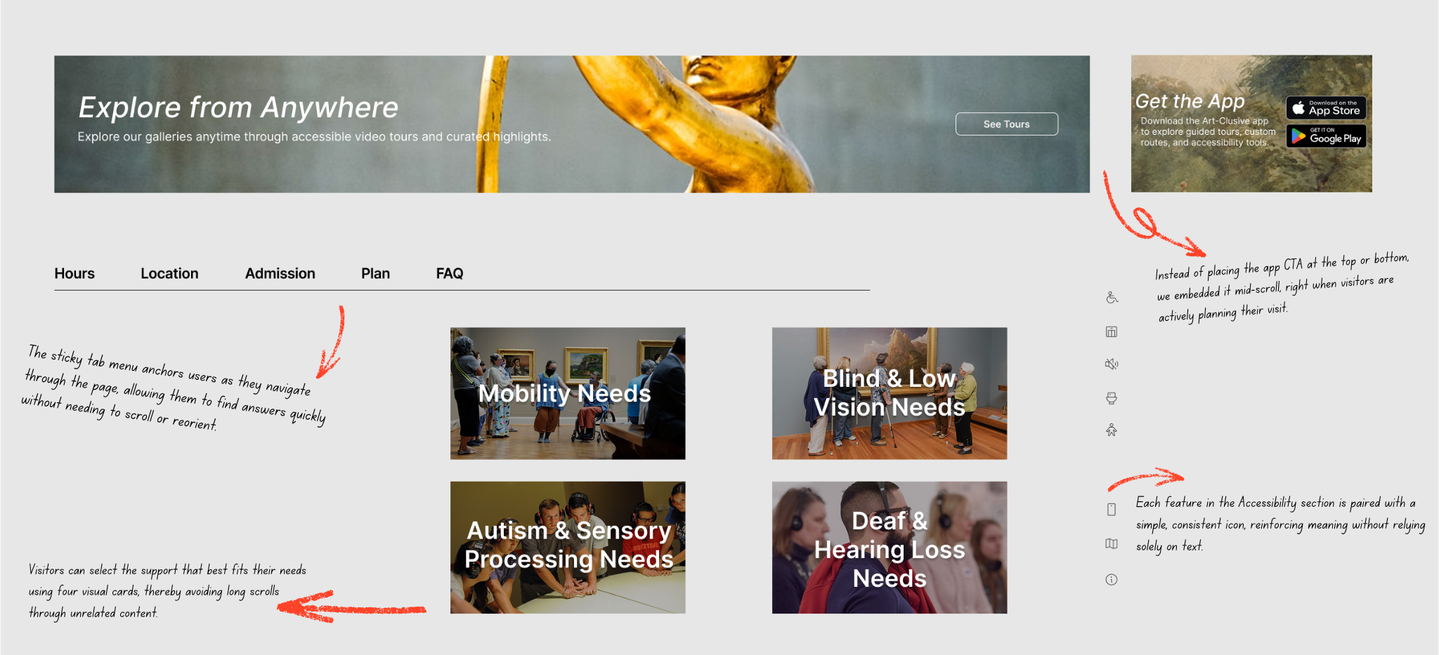
Design Details That Matter
Final Thoughts
Designing the Art-Clusive website provided me with the opportunity to expand a mobile-first concept into a fully responsive experience, rooted in clarity, planning, and inclusion. This case study challenged me to think critically about access, what people need before a visit even begins, and how design choices can either invite or exclude. I wanted the site to feel easy to move through, structured enough to guide people, but flexible enough to let them explore at their own pace. I’m proud of how this project creates space for both information and accessibility, and I’m looking forward to refining it further through user feedback and continued iteration.