
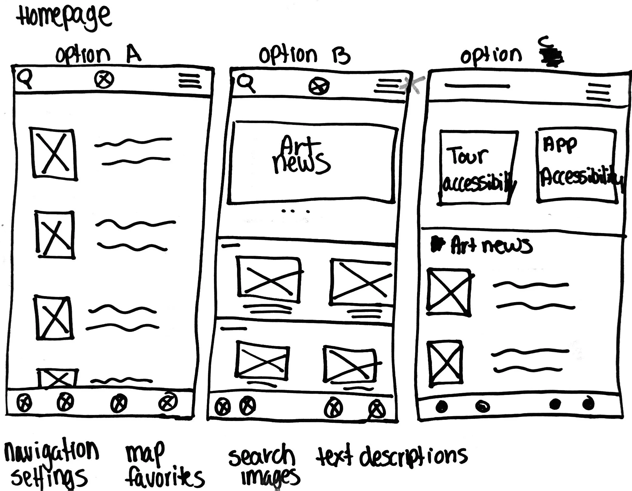
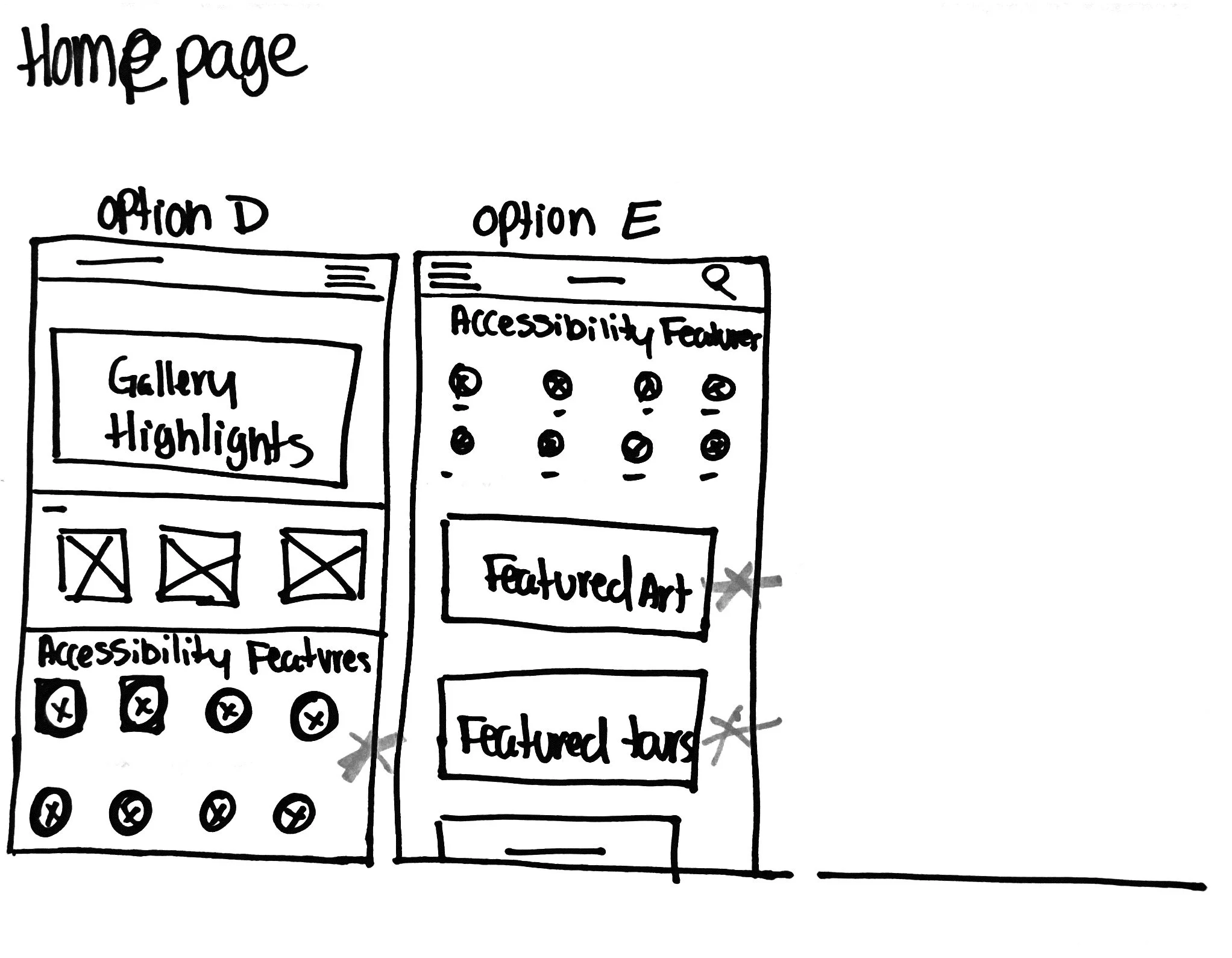
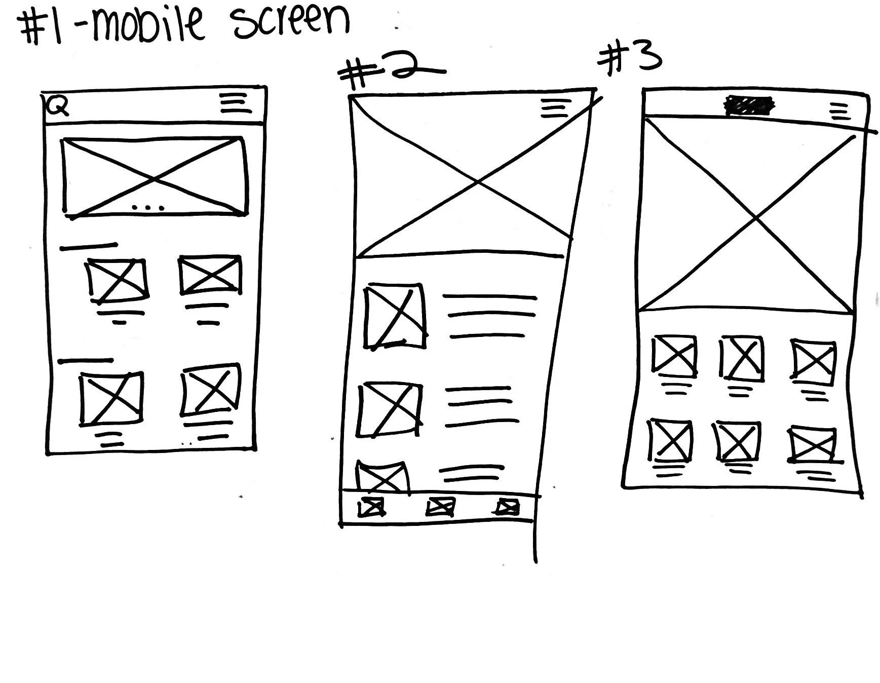
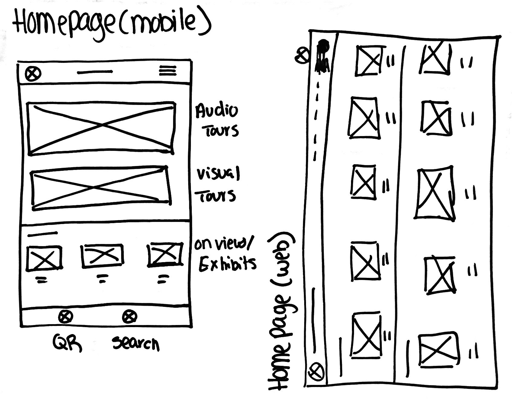
Mobile App Wireframes
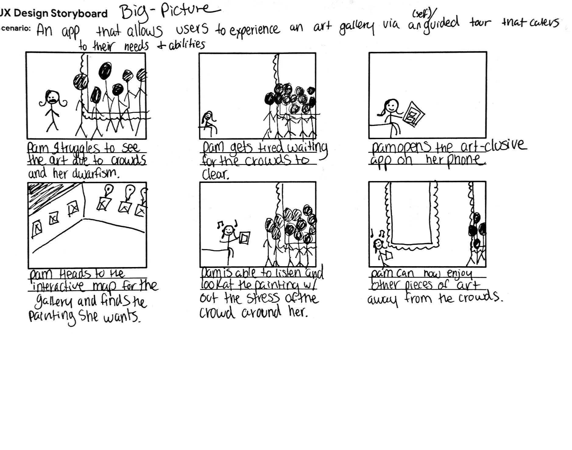
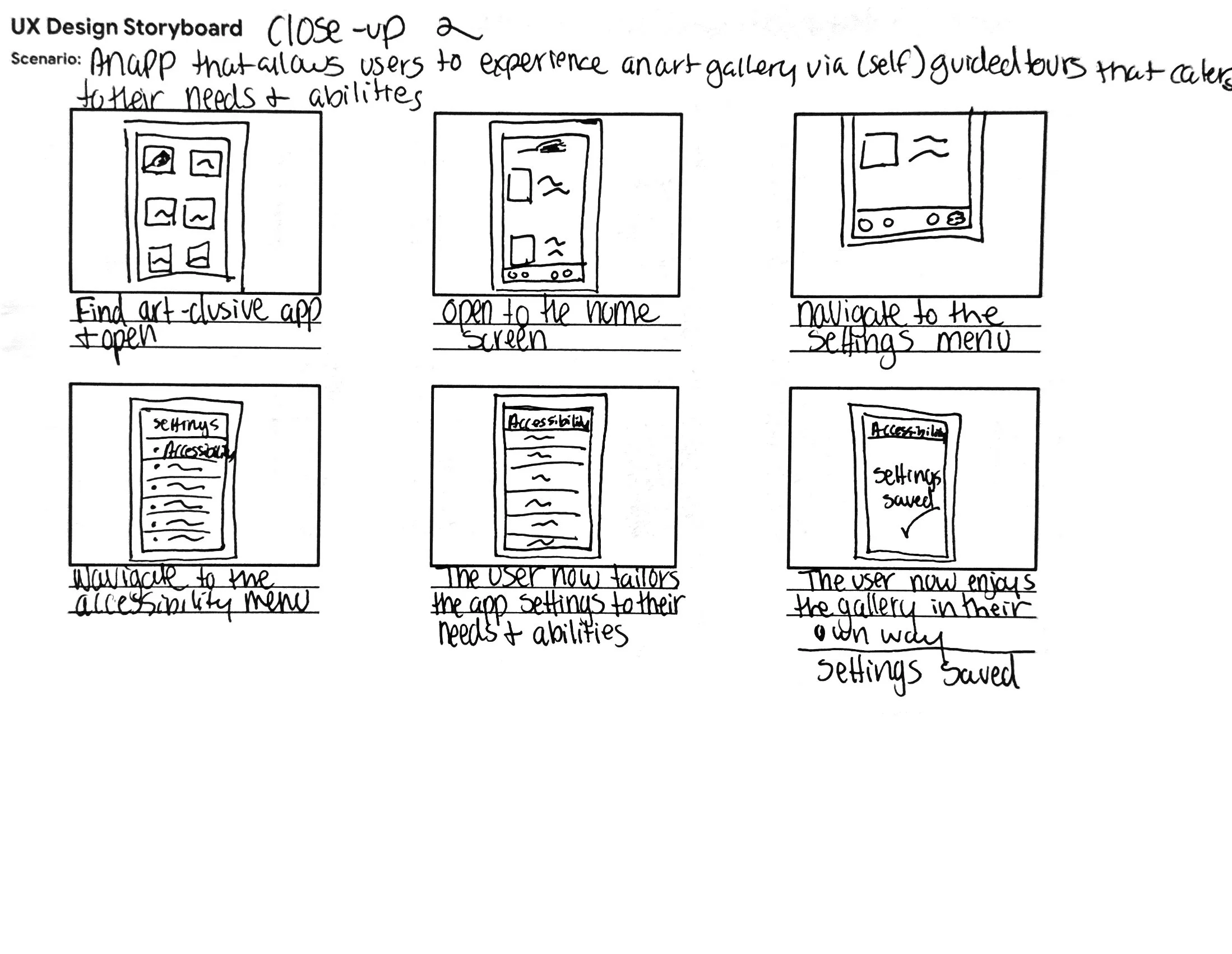
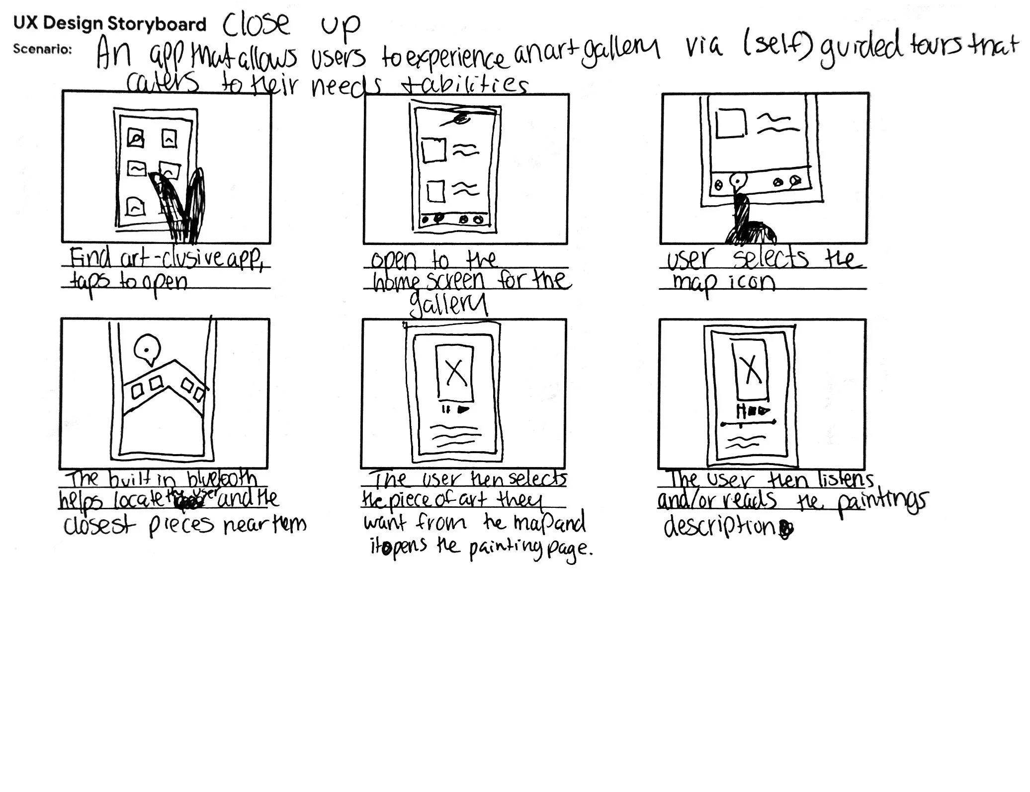
Storyboards
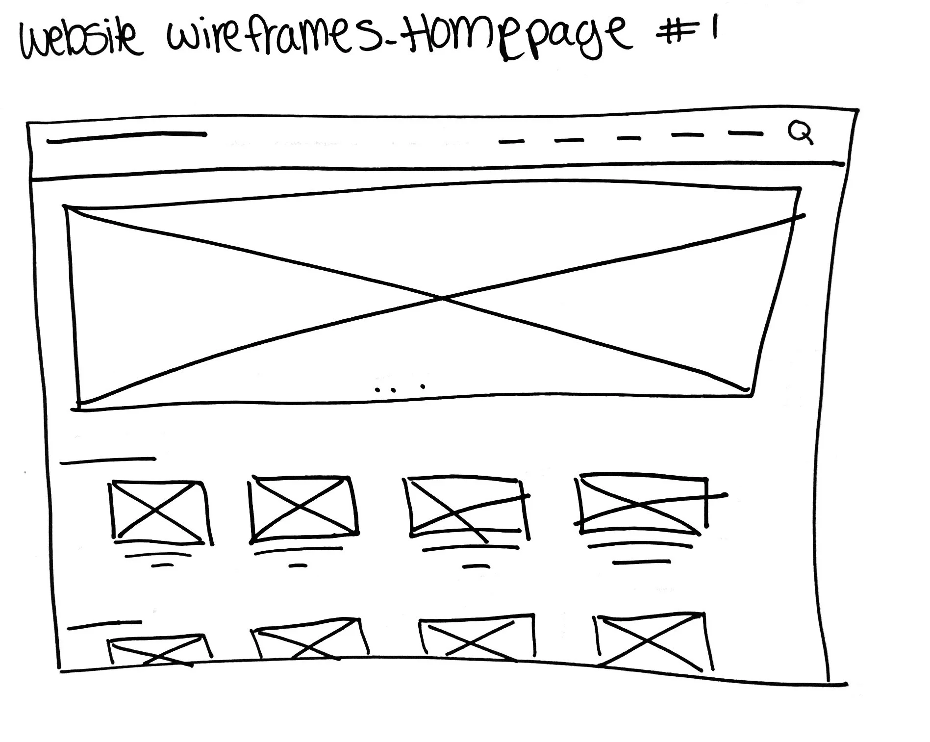
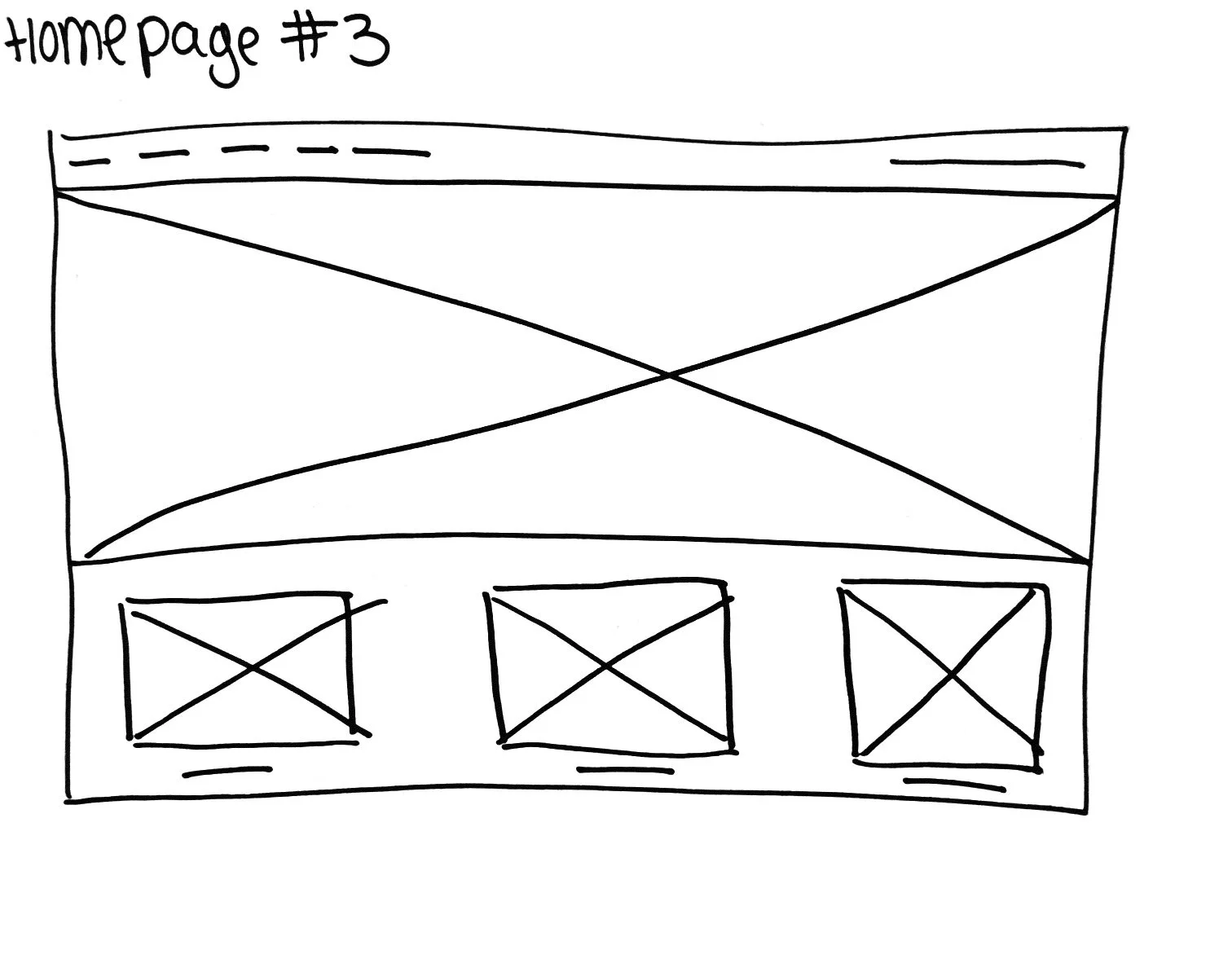
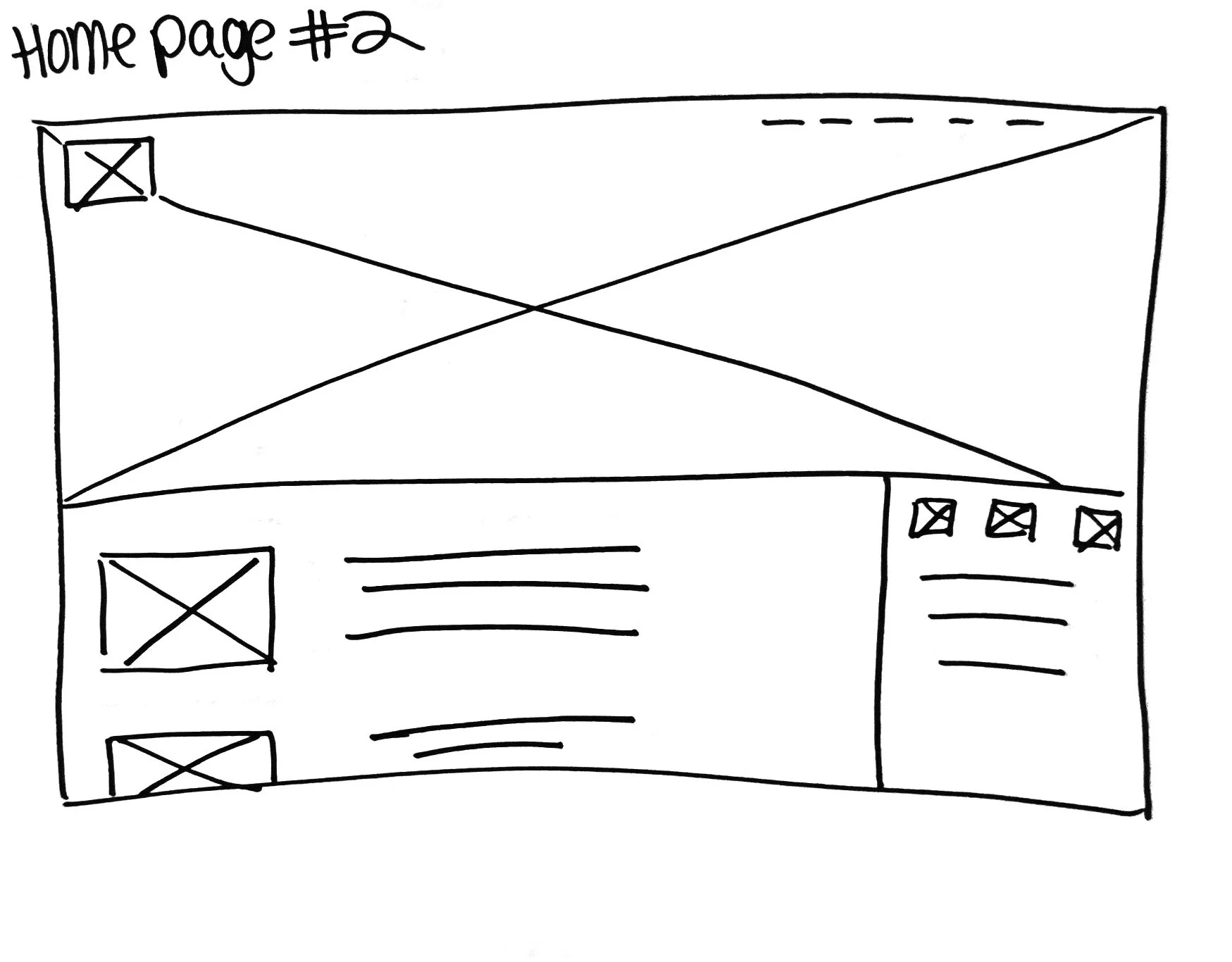
Website Wireframes
Lo-Fi Prototype
